
SwiftUIのButtonの使い方
2021年03月09日
タップした時にアクションを起こせるようにするためのコンポーネント
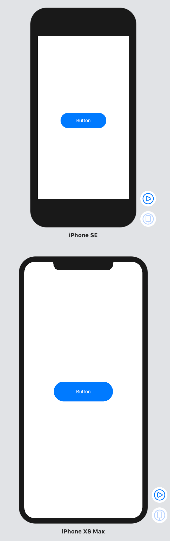
基本形は以下のようになります
Button(action: {
  // ボタンをタップした時のアクション
    print("tap buton")
}, label: {
    // ボタン内部に表示するオブジェクト
    Text("Button")
})

// 引数最後の関数を外に出した場合
Button(action: {
    print("tap buton")
}) {
    Text("Button")
}
色
Button(action: {
    print("tap buton")
}) {
    Text("Button")
}
.padding()
.accentColor(Color.white)
.background(Color.blue)

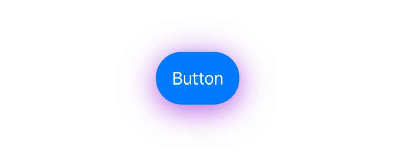
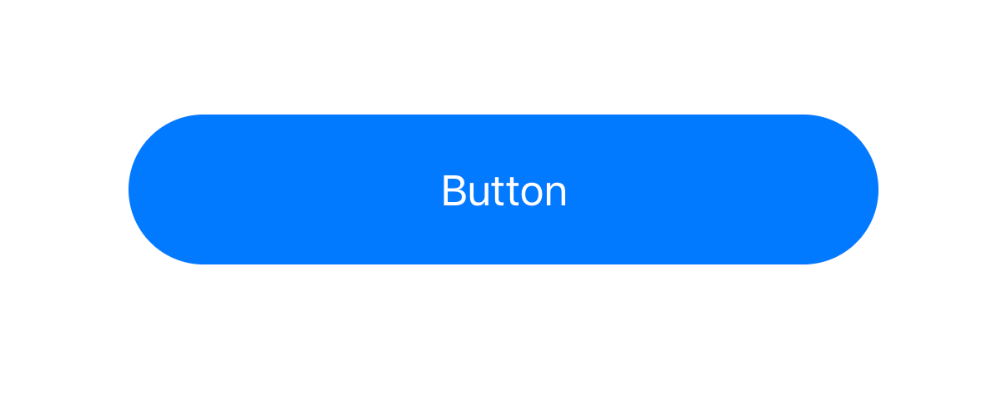
角丸・影
Button(action: {
    print("tap buton")
}) {
    Text("Button")
}
.padding()
.accentColor(Color.white)
.background(Color.blue)
.cornerRadius(26)
.shadow(color: Color.purple, radius: 15, x: 0, y: 5)
cornerRadius() には .infinity を指定する事で、大きさが可変しても短い辺に直線がないように調整出来ます
.cornerRadius(.infinity)
画像と合わせて表示
横並び・縦並びは HStack VStack で表現
// 横並びで表示
Button(action: {
    print("tap buton")
}) {
    HStack {
        Image(systemName: "suit.heart.fill")
        Text("Like")
    }
}
.padding()
.accentColor(Color.white)
.background(Color.blue)

// 縦並びで表示
Button(action: {
    print("tap buton")
}) {
    VStack {
        Image(systemName: "suit.heart.fill")
        Text("Like")
    }
}
.padding()
.accentColor(Color.white)
.background(Color.blue)

タップした時の色
タップした時の色はButtonのプロパティには存在しないため、ButtonStyleを使用
struct ContentView: View {
    var body: some View {
        Button(action: {
            print("tap buton")
        }) {
            Text("Button")
        }
        .buttonStyle(MyButtonStyle())
    }
}

struct MyButtonStyle: ButtonStyle {
  func makeBody(configuration: Self.Configuration) -> some View {
    configuration.label
        .padding()
        .foregroundColor(Color.white)
        .background(configuration.isPressed ? Color.red : Color.blue)
        .cornerRadius(12.0)
    }
}
configuration.isPressed でタップ判定が可能なため、タップされた時にボタンサイズを0.9倍にする、ボタンのopacitityを下げる、といった事も可能です。
struct MyButtonStyle: ButtonStyle {
  func makeBody(configuration: Self.Configuration) -> some View {
    configuration.label
        .padding()
        .foregroundColor(Color.white)
        .background(Color.blue)
        .cornerRadius(12.0)
        .scaleEffect(configuration.isPressed ? 0.9 : 1.0)
        .opacity(configuration.isPressed ? 0.4 : 1)
    }
}
サイズ
ボタンのサイズは Button に対してではなく、中に表示するオブジェクトのサイズによって決まります
固定値
Button(action: {
    print("tap buton")
}) {
    Text("Button")
        .frame(width: 300, height: 60)
}
.accentColor(Color.white)
.background(Color.blue)
.cornerRadius(.infiity)
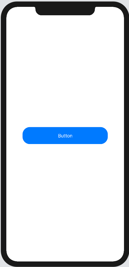
画面サイズに合わせてpaddingをとる
maxWidth: .infinity を指定し画面いっぱいに表示されるようにしつつ、Buttonに対し padding(.horizontal, 30) で横にpaddingを設けます。
Button(action: {
    print("tap buton")
}) {
    Text("Button")
        .frame(maxWidth: .infinity, minHeight: 60)
}
.accentColor(Color.white)
.background(Color.blue)
.cornerRadius(.infinity)
.padding(.horizontal, 30)
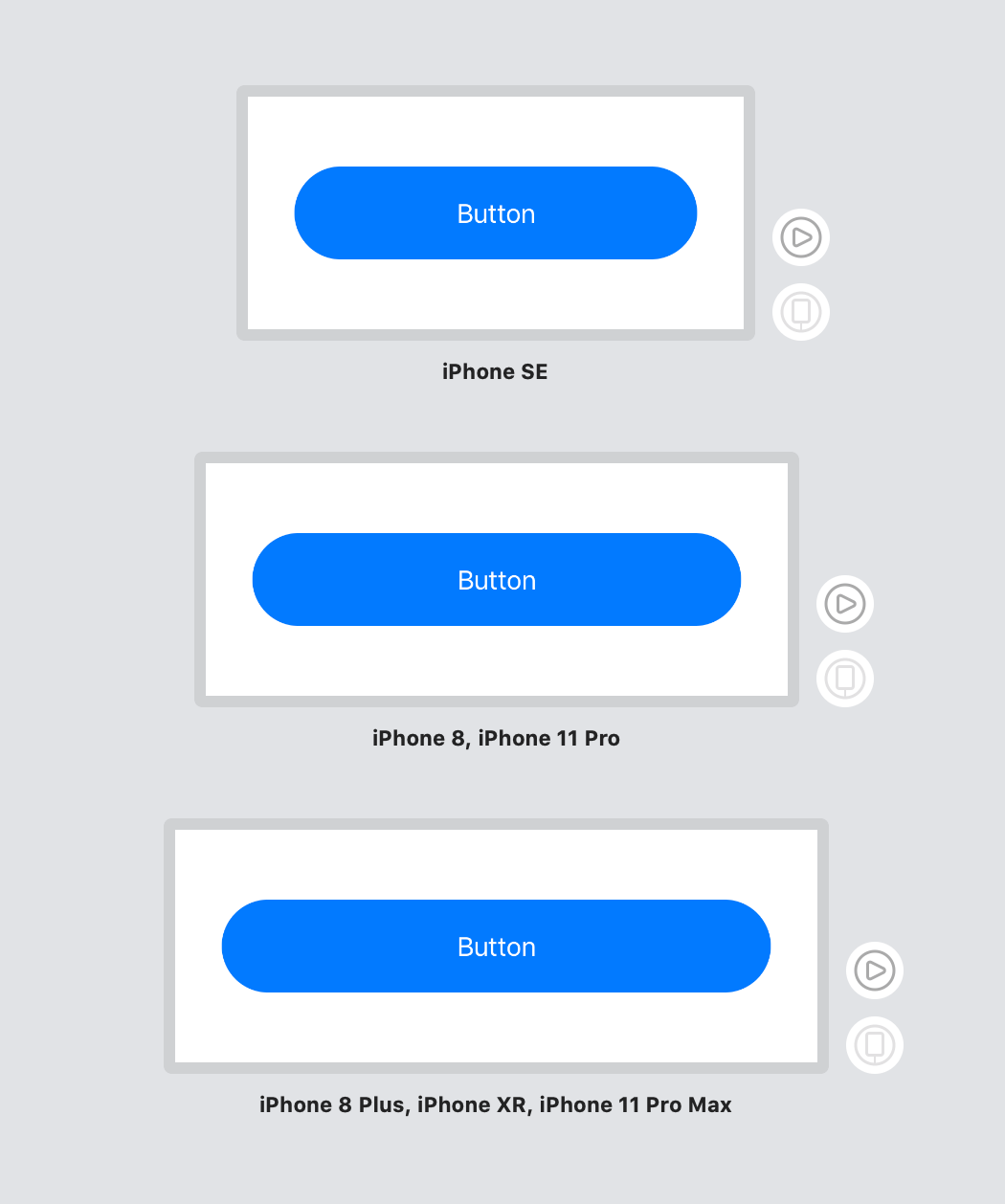
paddingをbackgroundの前などに書くなど、設定位置によって動作内容が変わってくる点に注意
パーセントで指定する
何を元に%指定をするかによって指定方法が変わります
画面サイズに合わせて指定する場合は UIScreen.main.bounds.size を使用します
Button(action: {
    print("tap buton")
}) {
    Text("Button")
        .frame(width: UIScreen.main.bounds.size.width / 6 * 4,
               height: UIScreen.main.bounds.size.width / 6 * 1)
}
.accentColor(Color.white)
.background(Color.blue)
.cornerRadius(.infinity)
親Viewに対して%指定する場合は GeometryReader を使用します
1つにまとめると長くなり過ぎるため GeometryReader でラップしたButtonを別コンポーネントで作成します
struct AspectButton: View {
    var body: some View {
        GeometryReader { geometry in
            Button(action: {
                print("tap buton")
            }) {
                Text("Button")
                    .frame(width: geometry.size.width / 6 * 5,
                           height: geometry.size.width / 6 * 1)
            }
            .accentColor(Color.white)
            .background(Color.blue)
            .cornerRadius(.infinity)
        }
    }
}
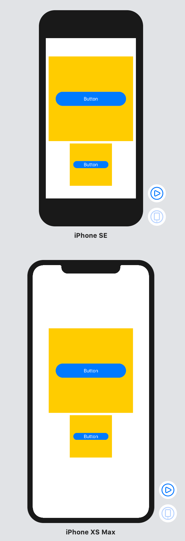
300 x 300 のVStack と 150 x 150 のVStackにそれぞれ先程のButtonを配置します
struct ContentView: View {
    var body: some View {
        VStack {
            VStack {
                AspectButton()
            }
            .frame(width: 300, height: 300)
            .background(Color.yellow)
            VStack {
                AspectButton()
            }
            .frame(width: 150, height: 150)
            .background(Color.yellow)
        }
    }
}